
-
Band of Others is populated with passionate Gamers maintaining friendships ranging days to decades. Members comprise of good people like you with widely varying levels of Gaming experience.
We actively support a wide range of Gaming Genres such as First Person Shooters, Role Playing Games, Simulations and even Strategy Games.
We maintain our own 500+ slot Teamspeak 3 Server with plenty of room for you and your friends to chat.
Join us today, you'll be glad you did!
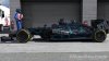
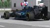
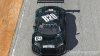
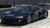
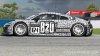
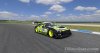
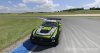
B2O Paint Schemes for iRacing
- Thread starter Kenadian
- Start date

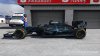
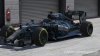
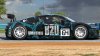

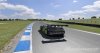
 That is one sexy looking race car... :icon_cool:
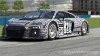

Twitch
iRacing Special Events 2026
ROAR: LMP3, GT4, Touring
~ Jan 9 - 10
Daytona 24: GTP, LMP2, GT3
~ Jan 16 - 18
Bathurst 12: GT3
~ Feb 20 - 22
Sebring 12: GTP, LMP2, GT3
~ Mar 27 - 29
~ Jan 9 - 10
Daytona 24: GTP, LMP2, GT3
~ Jan 16 - 18
Bathurst 12: GT3
~ Feb 20 - 22
Sebring 12: GTP, LMP2, GT3
~ Mar 27 - 29